
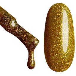
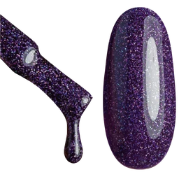
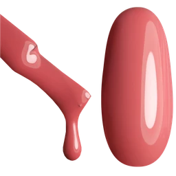
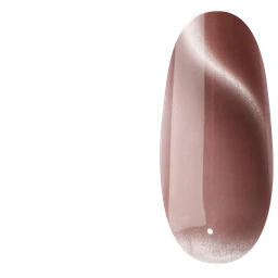
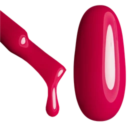
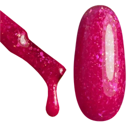
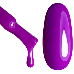
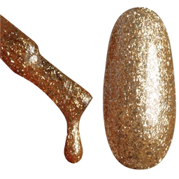
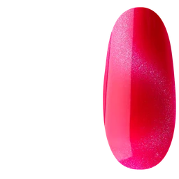
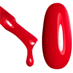
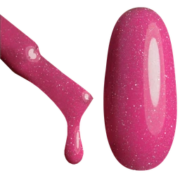
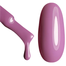
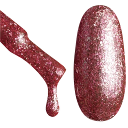
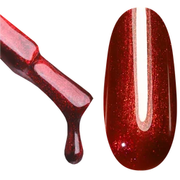
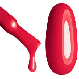
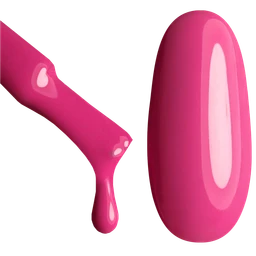
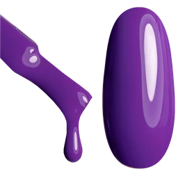
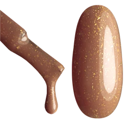
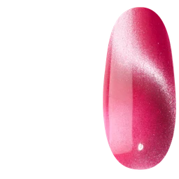
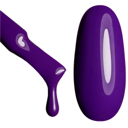
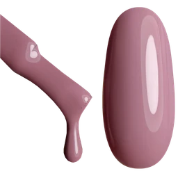
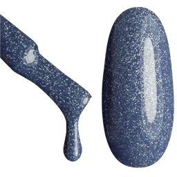
Wine explores the muted, cool side of deep red. A thin detail in a pale colour can separate its dark outline from the rest of the design.
Build a colour pairing
Wine with light pink: Light pink gives a gentle colour contrast against white. A pale reference colour does not establish coverage: compare the product photographs and coating information as well. Keep wine as the lead if you want this page’s colour direction to stay dominant.
Wine with cream: Cream adds warmth to an off-white palette. Compare it with a cooler white when choosing a neutral background for gold or brown accents. Keep wine as the lead if you want this page’s colour direction to stay dominant.
Compare the actual coating
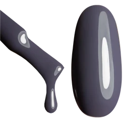
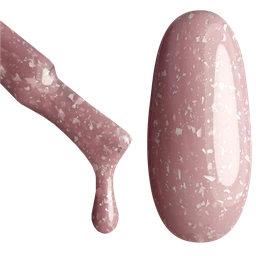
The colour swatch is a digital reference for this shade. Product matches are selected from catalogue colour data; photographs show the actual item. Check the product description for its finish and coverage, and compare a physical swatch when an exact match matters.
Questions
How do I choose a wine shade?
Wine explores the muted, cool side of deep red. A thin detail in a pale colour can separate its dark outline from the rest of the design.
Does a matching colour mean a matching formula?
No. Colour proximity does not establish product type, coverage, finish or curing instructions. Check the selected product and its application guidance.